The world of digital marketing moves at a frantic pace. Google’s updates, evolving technology, and increasing competition keep even the most organised businessperson on their toes.
However, there are a few consistent components that are essential foundations for your Ecommerce success. One critical element you must master is website architecture.
In this post, you’ll learn what website architecture is, why it’s important, and best practices to help you maximise leads and sales.
What is website architecture?
The short answer is that website architecture is how various elements of your business’ website fit together. At its core, website architecture is about creating a site with a logical layout, functional aspects, and security parameters geared to help searchers and web crawlers find what they need on your website.
Using website architecture best practices enables you to structure your site optimally. Ultimately, this will improve your SEO, as well as help you grow your business.
Why is It important?
Think about the worst experience you have ever had on a website. Perhaps you could not find what you needed, or you clicked icons, then nothing happened. Maybe you clicked your way through several pages of irrelevant content, became frustrated and bounced to a different site. This experience is why website architecture is vital to your business’ success.
In addition to making your website more accessible and more enjoyable for your visitors, a website with optimal architecture can improve your SEO.
Here are the top two reasons:
- If all of your pages link together correctly, Google’s web crawling spiders can follow your internal links and index all of your information. Pages that are not linked or are several clicks away from your homepage are difficult for spiders to find and index. As a result, relevant content that could improve your SERP ranking may go unnoticed.
- When you internally link to high authority pages, the increased page rank will improve the SEO of those pages.
Best practices
Putting together a website with first-rate architecture is less complex if you include these best practices.
URL structure
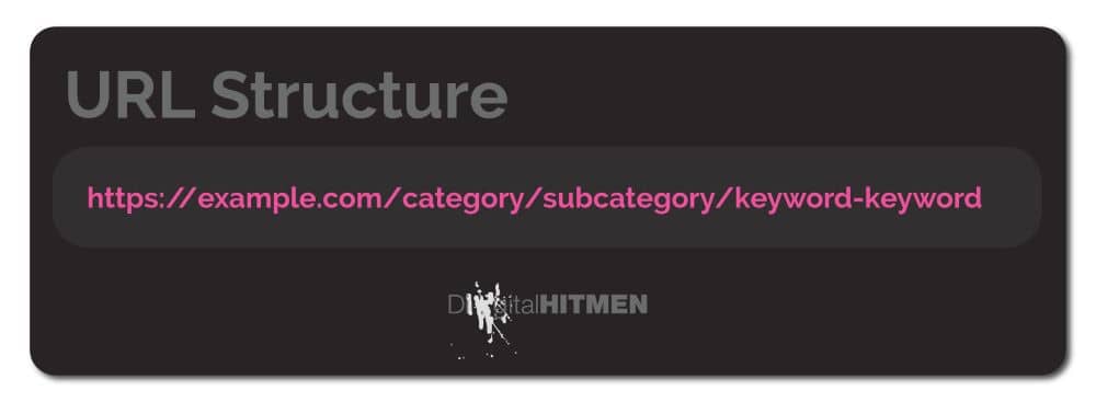
Even though some would argue that your URL structure is not vital to your website’s ranking, having a URL with good descriptive words makes it easier for searchers and web crawlers to find you. Additionally, URLs that are descriptive and straightforward help to indicate what you will find on the website.
You will want your URL structure to follow your categories straightforwardly. While all of your URLs do not have to follow this pattern, make sure they all share the same configuration.
Site navigation
Visitors to your website do not want to become entrenched in a maze when navigating your site. Keep your site as uncluttered as possible. Streamline the number of choices on your navigation bar. Experts suggest that the maximum number of items on your navigation bar is seven.
Additionally, arrange your items with the most important at the beginning of the navigation and incrementally decrease in importance.
Other site navigation points to keep in mind:
- Make your information accessible
- Design your site so it works well with every screen size
- Add secondary navigation to help visitors find their way
- Be consistent with all of your pages
Internal linking
Essentially, your website architecture hinges on how you link your pages together. To give visitors to your site the best experience possible:
- Begin with your navigation menu
- Next link to category pages
- From category pages link to individual pages within the category
Make sure that your links are HTML. Google bots can easily crawl these links. Additionally, use relevant internal links to other pages on your website.
Remember that authoritative and interlinked websites get sitelinks automatically.
Image compression
There is no doubt that the best websites include brilliant images. After all, there is a reason the old saying a picture is worth a thousand words still ring true. However, your pictures may be working against you.
Problems arise when the images used to make your site a more useful and enjoyable place cause your website to respond slowly. Once a site becomes sluggish and unresponsive, visitors will bounce to the next website without a second thought.
If, for some reason, you doubt the importance of page speed, take a look at these statistics regarding loading speed as it relates to bounce rate.
If a website’s load time goes from:
- 1 second to 3 seconds bounce probability goes up 32%
- 1 second to 5 seconds bounce probability goes up 90%
- 1 second to 6 seconds bounce probability goes up 106%
- 1 second to 10 seconds bounce probability goes up 123%
Compressing your images is the simplest way to make sure your website looks fantastic and has a speedy loading time. Google’s PageSpeed Insights is an excellent tool to help you see how images impact your site speed.
Once you see what is bogging down your site, a tool such as Compressor.io can reduce your image size. This results in a win/ win for you. You will have a website that looks wonderful and is lightning fast.
Sitemaps
A valuable way to help your website visitors and Google bots find their way around your site is by creating a sitemap. The suggested format for sitemaps is .xml. An excellent place for assistance with sitemaps is XML Sitemaps. Alternatively, using a WordPress plugin like Yoast will automatically generate a well structured sitemap.
Content organisation
Having your content arranged logically and organised is an absolute MUST for good website architecture.
We thrive on a clear and understandable path from point A to point B. Imagine your frustration if you were trying a new recipe and ingredient lists were interspersed with cook times, techniques, and unrelated information.
Sorting and situating content is a daunting task. For the best results, try to break the job down into smaller pieces. Here is an example of a way to organise your content for optimal website architecture.
- List your pages: You will want everything from your homepage to your privacy policy. As you go over these, consider how your customers will use your site and arrange your content accordingly.
- Create a call to action for your pages – To prevent dead ends and bounce, use the call to action to guide your visitor through your site in a natural and uncomplicated way.
- Use visual cues – Place elements like headers, subheaders, and sections to help your visitors scan your page for the products or information they want.
- Gather your copy and visuals, and be consistent
- Streamline – You will want to break your website into manageable pieces for your visitors, especially if your site is extensive.
Must-haves
Regardless of your company’s size or niche, it is necessary to keep in mind the fact that over 1.8 billion websites are clamouring for attention at any given moment.
Your website cannot be ‘just okay or good enough’ if you want to be at the top of the SERPs.
Here are half a dozen must-haves for your website:
-
-
- Accessibility
- Credibility
- User-centricity
- Simplicity
- Responsiveness
- Easy to Navigate
-
Need help?
The task of overseeing your business’ website architecture can seem daunting, especially if you lack the time and personnel to devote to the task.
Eliminate stress and have a brilliantly structured website with killer content by teaming up with the experts at Digital Hitmen. Contact us to learn more about how we can help your business reach its true potential.


